CCDC Results Visualization Tutorial (GUI)
By Paulo Arévalo. Updated April 3, 2021
To faciliate easy access to our API we have created a series of apps with graphical user interfaces that require no coding by the user. These guis can be used for calculating CCDC model parameters (i.e. regression coefficients), displaying and interacting with CCDC coefficients and corresponding pixel time series, and classification of the model parameters. This tutorial will demonstrate the GUI for exploring Landsat time series and temporal segments fitted by the CCDC algorithm, as well as visualizing coefficients of the temporal segments, predicted imaged and change information.
In this guide you will learn how to:
Explore time series of Landsat observations for a single pixel, as well as the temporal segments fitted on them by the CCDC algorithm.
Visualize different coefficients of the temporal segments over space.
Visualize images predicted from the temporal segments.
Visualize change information.
The tool used in this tutorial can be found here.
The tool might look like in the image below when you load it for the first time. To make sure you can visualize the map, please lower the separator bar that divides the map area and the time series chart area shown below.
The panel on the left controls the parameters for running CCD interactively for any point in the world with Landsat coverage. The panel on the right controls the interaction with the loaded CCDC results, and allows you to create predicted (synthetic) images, visualize maps of CCDC coefficients, and map the changes detected by the algorithm.
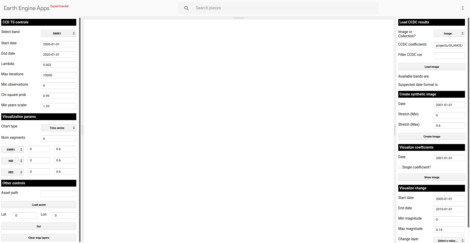
Lower the horizontal division on top if the map is not visible..
Creating charts of time series and interacting with them
If you want to visualize time series of Landsat spectral bands or a subset of indices derived from them given location, use the panel on the left to set up the desired band and time range (Upper subpanel). Other CCD parameters can be left at their default parameters. For this exercise we will look at landscape dynamics in the state of Rondônia, in Brazil. In the example below, time series of the SWIR1 band are displayed after clicking on the map in a pixel that shows a forest clearcut. In this example there are time segments present for the entire time series. However, if you click in places with a lot of changes (e.g. agricultural lands in California) you might notice that there are some segments missing in the chart. If this happens, you will need to increase the Num segments parameter (e.g. to 10) in the Visualization params section (Mid subpanel) and click on the pixel again. Creating the chart might take a little longer. You can also click on the points in the chart and they will be added to the map according to the visualization parameters selected for the RGB combination. Currently, the changes made there are not immediate, you need to set them before clicking on the map for them to take effect. In the example below, I clicked on an observation circa 2003, and the image loaded with the predefined RGB combination of SWIR1/NIR/RED.
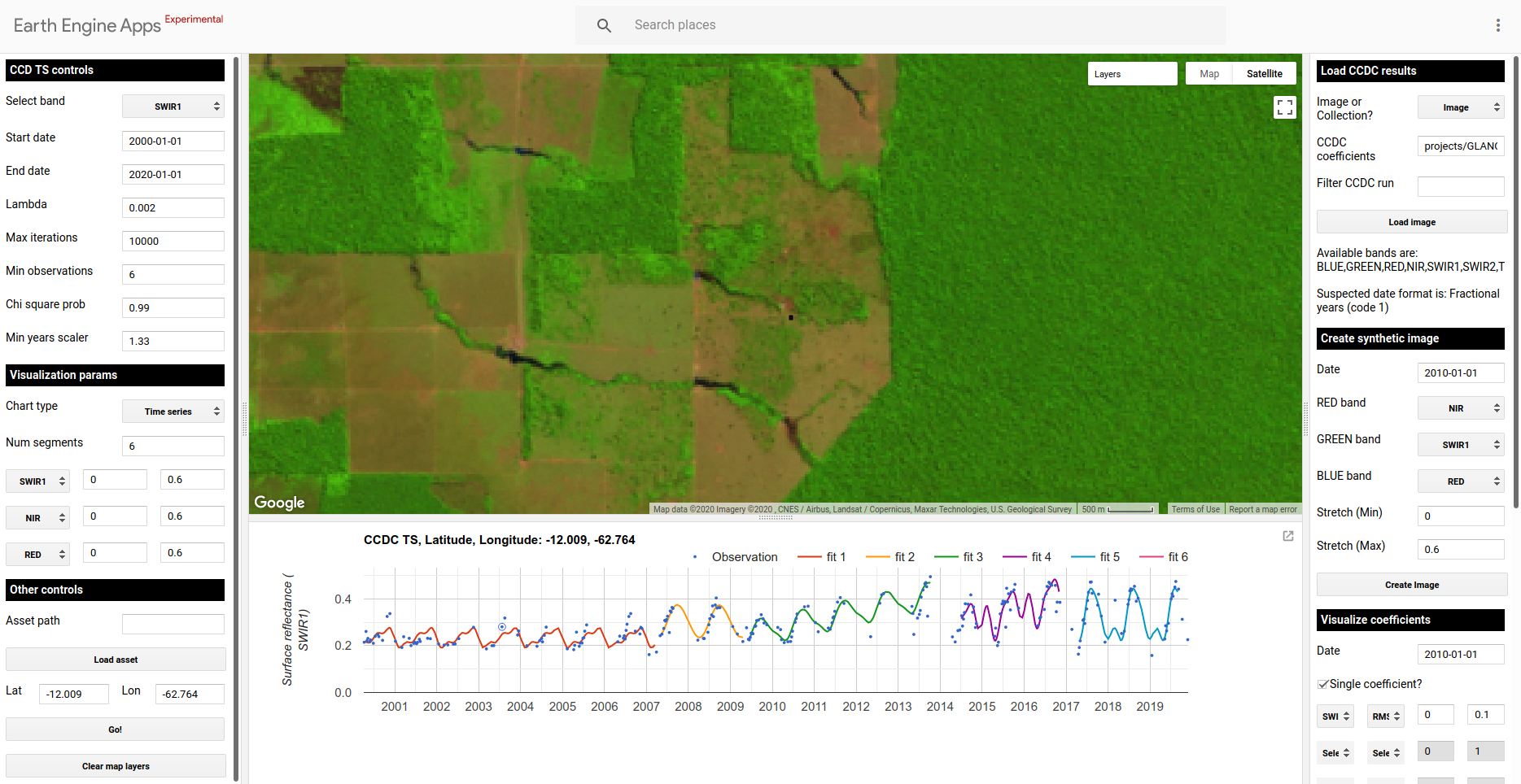
Time series of a pixel with agricultural dynamics following a forest clearcut
We can also visualize the time series as a “day of year” (DOY) plot. This is useful if we are looking at a place that displays seasonal changes, such as vegetation phenology or flooding. In the example below, I changed the chart type to DOY and clicked on a pixel located south east from the previous example. This is a place that experiences seasonal flooding.
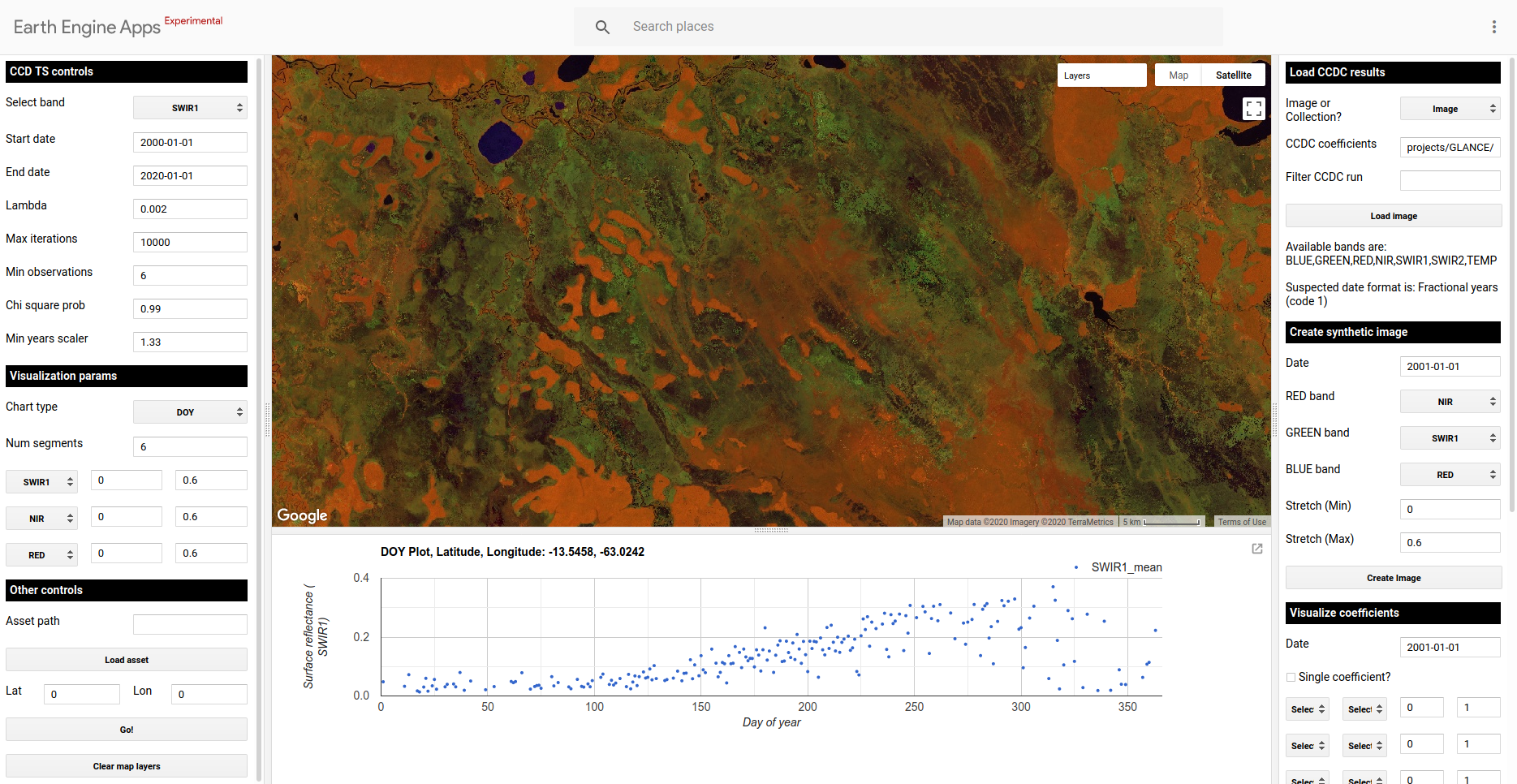
Visualizing the DOY plot for a seasonally flooded pixel. The image shown is a previously loaded image with RGB combination NIR/SWIR1/RED. Open water and wet vegetation tend to appear blue and black in this combination, respectively.
Finally, the lower subpanel allows you to add any of your own ee.FeatureCollection assets to the map. This could be useful if you want to investigate the time series for specific point, or overlay boundaries to visualize changes for an area of interest. Given the current limitations imposed by GEE, the assets need to be publicly shared to be “seen” by the app, or they need to be shared by the owner of the app. The panel also allows you to enter a set of coordinates for quick navigation to a specific location, and to clear all current layers in the map.
Loading CCDC results
In order to use the subpanels on the right panel to generate maps of predicted images, coefficients and changes, you need to load pre-existing CCDC results. After this step is done, the rest of the sections in the tools can be used in any order. Keep in mind that this steps is not necessary to visualize the time series of clicked points in the map (left panel of the tool). To load pre-existing CCDC results, look at the top right panel in the app, it must look like this:
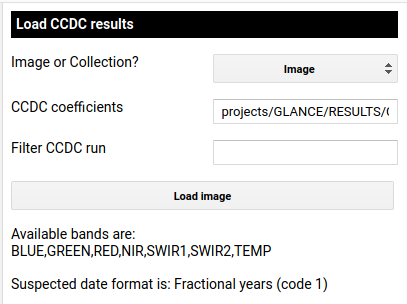
Select which CCDC resutls to load using this panel. Once loaded, it will display the available band names and suspected date format of the results, if stored in the metadata at the time of creation in a property named ‘dateFormat’.
The first few parameters describe the format of the CCDC results. First, are they saved as a single image or a collection? Next is the path to the CCDC results. When the two fields below the button show their corresponding information, you will be able interact with the rest of the options in the control panel in any order. For this example, we will load the output of CCDC run for an area between Bolivia and Brazil. This is the predifined example in the tool. The tool has also been tested with the upcoming results of a global CCDC results that will be published in the near future.
Visualizing CCD coefficients and change information
Once the results have loaded, you can use the subpanels in the right as follows, in any order:
Generate predicted images: You can use the Create synthetic image panel to generate a predicted surface reflectance image for the date you specify. This is done by finding the intersecting temporal segement and using the coefficients to generate a predicted image for that date. The image will be displaed using the RGB combination specified using the dropdown boxes.
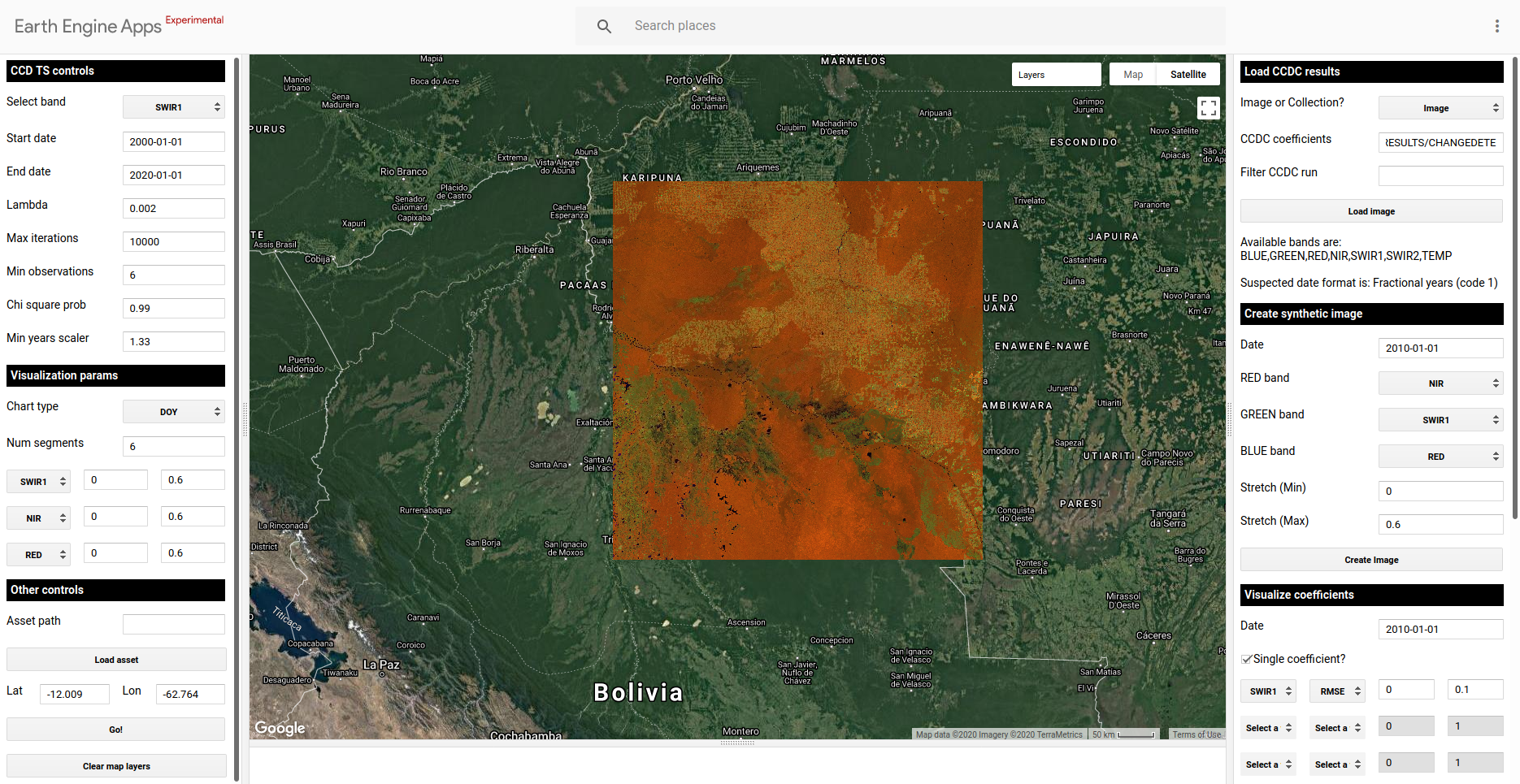
Example of a predicted (synthetic) image circa 2010-01-01 in an area between Bolivia and Brazil. The image also shows the extent of the loaded CCDC results. The RGB color combination is NIR/SWIR1/RED
Generate maps of CCDC coefficients: You can use the Visualize coefficients panel to query and visualize the model coefficients and RMSE that intersect a given date. You can either visualize individual coefficient and specify the min and max values to stretch the visualization to, or you can create RGB images of different bands and min/max stretch values. In the image below you can see the RMSE of the nearest segment to the date 2010-01-01 for the south western portion of the image. Seasonally flooded areas will present more variability in the time series than stable forest or grasslands, resulting in a model fit with higher RMSE. You can experiment with changing the bands, coefficients and RGB combination.
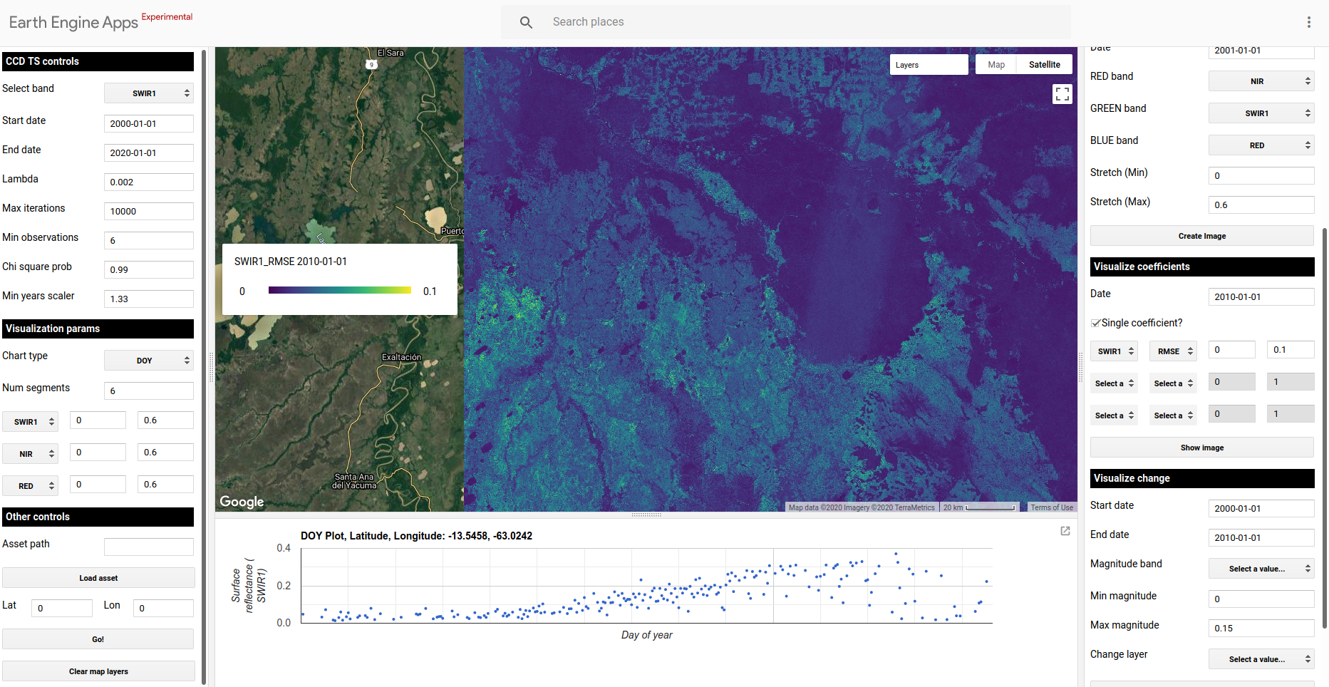
Example of an image showing the RMSE of the fitted model circa 2010 for a region in Brazil, with its corresponding legend on the left, and the DOY plot previously loaded for a clicked pixel.
Visualize change information: You can use the Visualize change panel to generate the following change layers:
Max change magnitude: Value of the largest detected change for the specified time period and spectral band, as measured by the difference between the end and start point of adjacent temporal segments.
Time of max magnitude of change: For the given date range and spectral band, visualize the time when the max detected change magnitud ocurred.
Number of changes: For the specified time period, display the total number of changes detected.
The image below shows an example of the timing of max magnitude of change for the period 2000-2018 in the SWIR1 band, capturing the extent and timing of change, mostly forest loss, in the northwestern corner of the study area. The time series below correspond to a clicked pixel in one of those areas, showing a clear forest conversion around mid 2017.
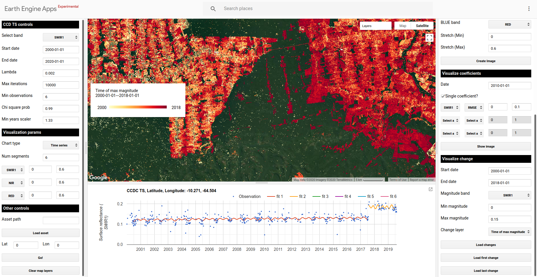
Map of the timing of max magnitud of change between 2000-2017 for the SWIR1 band, delineating historical patterns of forest loss and land cover change.