CCDC Results Visualization Tutorial (GUI)
By Paulo Arévalo. May 14, 2020
To faciliate easy access to our API we have created a series of graphical user interfaces (GUIs) that require no coding by the user. These guis can be used for calculating CCDC model parameters (i.e. regression coefficients), displaying and interacting with CCDC coefficients and corresponding pixel time series, and classification of the model parameters. This tutorial will demonstrate the GUI for exploring Landsat time series and temporal segments fitted by the CCDC algorithm, as well as visualizing coefficients of the temporal segments, predicted imaged and change information.
In this guide you will learn how to:
Explore time series of Landsat observations for a single pixel, as well as the temporal segments fitted on them by the CCDC algorithm.
Visualize different coefficients of the temporal segments over space.
Visualize images predicted from the temporal segments.
Visualize change information.
The tool use in this tutorial can be found here.
The tool might look like in the image below when you load it for the first time. To make sure you can visualize the map, please lower the separator bar that divides the map area and the time series chart area shown below.
The panel on the left controls the parameters for running CCD interactively for any point in the world with Landsat coverage. The panel on the right controls the interaction with the loaded CCDC results, and allows you to create predicted (synthetic) images, visualize maps of CCDC coefficients, and map the changes detected by the algorithm.
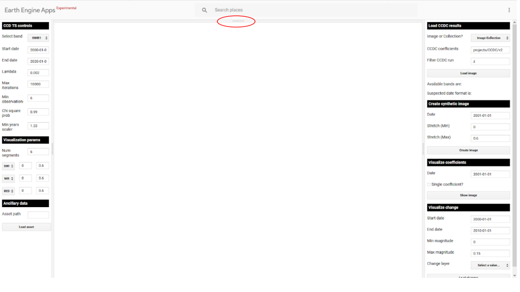
Lower the horizontal division on top if the map is not visible..
Creating charts of time series and interacting with them
If you want to visualize time series of Landsat spectral bands or a subset of indices derived from them given location, use the panel on the left to set up the desired band and time range (Box 1). Other CCD parameters can be left at their default parameters. In the example below, time series of the SWIR1 band are displayed after clicking on the map. You will notice that there are some segments missing in the chart. If this happens, you need to increase the Num segments parameter (e.g. to 10) in the Visualization params section (Box 2) and click on the pixel again. Creating the chart might take a little longer. You can also click on the points in the chart and they will be added to the map according to the visualization parameters selected for the RGB combination (Box 3). Right now any changes made there are not set on the fly, you need to set them before clicking on the map for them to take effect. In the image below, I clicked in one of the points and the image loaded with the default RGB combination.
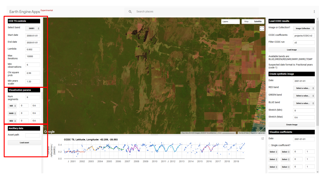
Time series of a pixel with agricultural dynamics in Brazil
The left panel also allows you to add any of your own assets (either image or feature collection) to the map. Given the current limitations imposed by GEE, the assets need to be publicly shared to be “seen” by the app, or they need to be shared by the owner of the app. In the example below I changed the band to display NBR time series and modified the start date to begin in 1985. I set an RGB combination of NIR/SWIR1/RED that will be used to display the images loaded from the time series chart. Finally, I clicked on a pixel, and then clicked in the point show in the time series chart to visualize the image for that date.
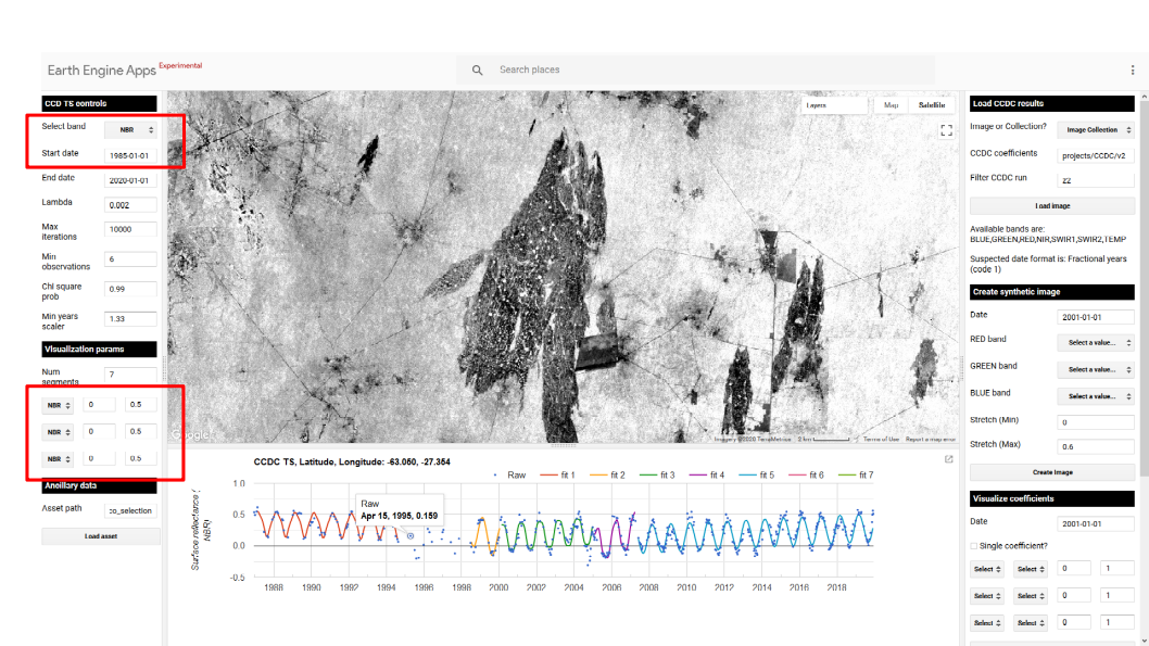
Setting the parameters to run CCD on the fly and visualize images from the time series chart
Loading CCDC results
In order to use the subpanels on the right panel to generate maps of predicted images, coefficients and changes, you need to load pre-existing CCDC results. After this step is done, the rest of the sections in the tools can be used in any order. Keep in mind that this steps is not necessary to visualize the time series of clicked points in the map (left panel of the tool). To load pre-existing CCDC results, look at the top right panel in the app, it must look like this:
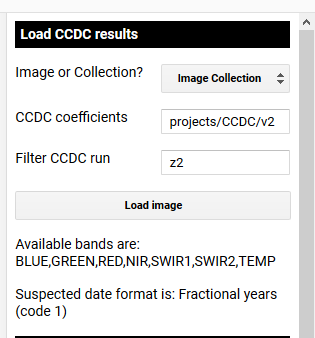
Select which CCDC resutls to load using this panel. Once loaded, it will display the available band names and suspected date format of the results, if stored in the metadata at the time of creation.
The first few parameters describe the format of the CCDC results. First, are they saved as a single image or a collection? Next is the path to the CCDC results.Even though they are not officially public yet, we can interact with some of the CCD results that have been executed by Google. The default values, particularly the “z” in the filter CCDC run, contain results for the period between 1999-2020. After setting the desired run prefix, you can click on the Load image button. When the two fields below the button show their corresponding information, you will be able interact with the rest of the options in the control panel in any order.
Visualizing CCD coefficients and change information
Once the results have loaded, you can use the subpanels in the right as follows, in any order:
Generate predicted images: You can use the Create synthetic image panel to generate a predicted surface reflectance image for the date you specify. This is done by finding the intersecting temporal segement and using the coefficients to generate a predicted image for that date. The image will be displaed using the RGB combination specified using the dropdown boxes.
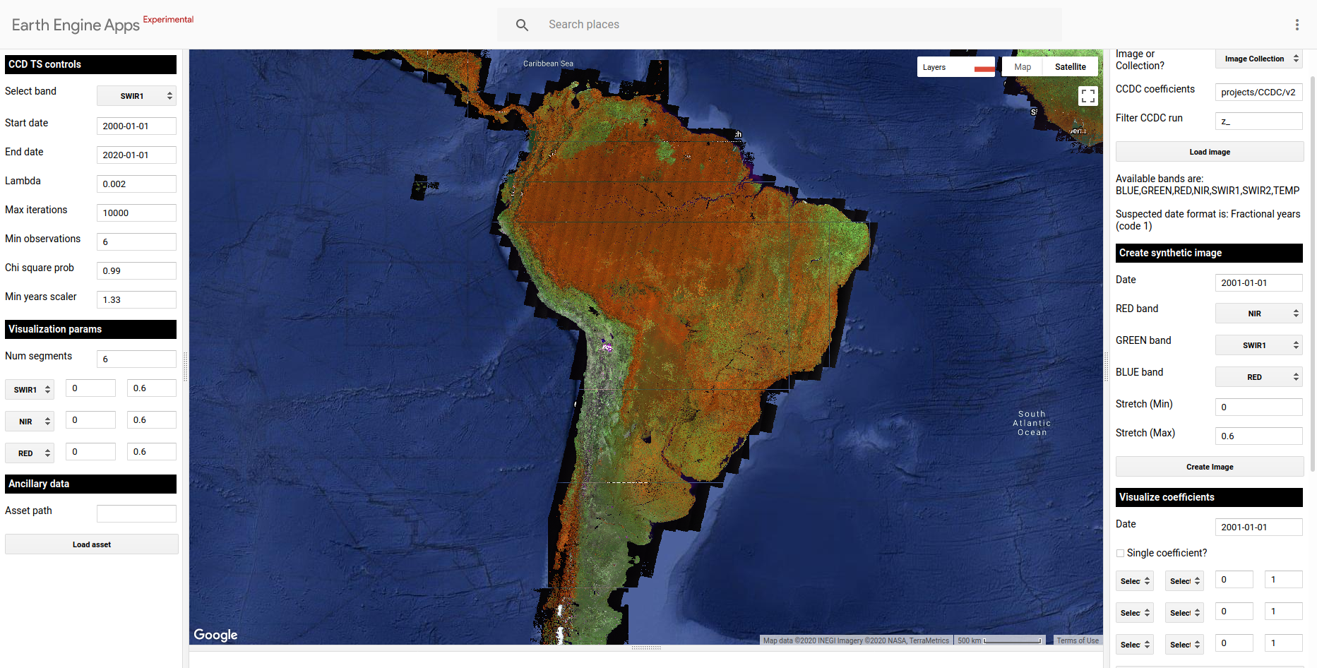
Example of a predicted (synthetic) image circa 2001-01-01 for South America. The RGB color combination is NIR-SWIR1-RED
Generate maps of CCDC coefficients: You can use the Visualize coefficients panel to query and visualize the model coefficients and RMSE that intersect a given date. You can either visualize individual coefficient and specify the min and max values to stretch the visualization to, or you can create RGB images of different bands and min/max stretch values. In the image below you can see the RMSE of the nearest segment circa 1995 for a location in Brazil. You can see the fire scars are visible in the loaded image. You can experiment with changing the bands, coefficients and RGB combination.
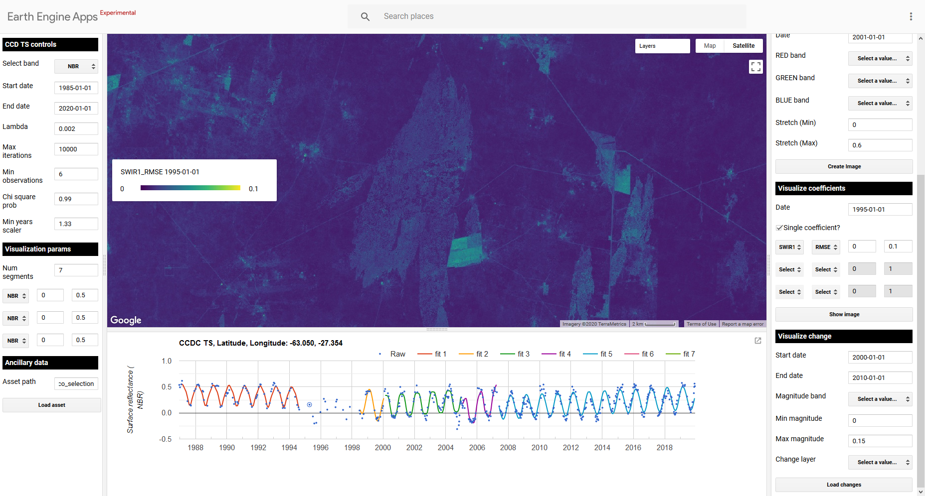
Example of an image showing the RMSE of the fitted model circa 1995 for a region in Brazil, with its corresponding legend on the left, and the time series of the NBR index and fitted models for a clicked pixel in that general area.
Visualize change information: You can use the Visualize change panel to generate the following change layers:
Max change magnitude: Value of the largest detected change for the specified time period and spectral band, as measured by the difference between the end and start point of adjacent temporal segments.
Time of max magnitude of change: For the given date range and spectral band, visualize the time when the max detected change magnitud ocurred.
Number of changes: For the specified time period, display the total number of changes detected.
The image below show an example of the timing of max magnitude of change for the period 1994-1997 in the SWIR1 band, capturing the extent of the fire scars shown before very clearly.
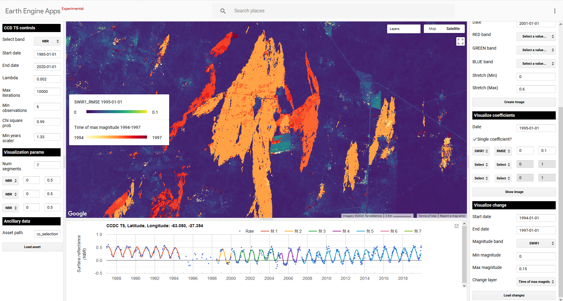
Map of the timing of max magnitud of change between 1994-1997 for the SWIR1 band, delineating the fire scars in this region of Brazil.